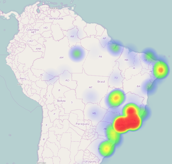
How to create interactive tweets heatmaps
This posts shows how to create heatmaps of conversations taking place on Twitter, this is a proof of concept technic to learn more about our current datasets, this knowledge would be latter applied to the product development cycle. My objective here is to share a simple way to create a quick visualization and be able to make an internal demo.
###
TL;DR; The source code and interactive version is available below.
The render will looks like this:

This dataset contains tweets from the Brazilian Elections of 2014
#
Extract the points from tweets
Because information about coordinates is not present on all tweets, we need to filter out those tweets that doesn’t contains any geographic information.
Important: From Twitter docs: The inner coordinates array is formatted as geoJSON (longitude first, then latitude).
Note that we also converted the JSON to CSV so it will be easier to aggregate on a latter step.
As you can see, jq makes the task really straight forward:
$ cat elections.json | \
  jq -r '. | select(.coordinates.type =="Point") | .coordinates.coordinates | @csv' \
  > coordinates-elections.csv
Just to get some statistics about the presence of coordinates, because it is opt-in field on the Twitter Client, I analyzed a dataset of 2M tweets and it had ~50,000 tweets with coordinates, total of 2.5%.
$ wc -l elections.json coordinates-elections.csv
  1998078 elections.json
    49671 coordinates-elections.csv
The content of coordinates-elections.csv looks like:
-59.999697,-3.136008
-34.982386,-8.233985
-63.212682,9.814692
-49.269657,-25.431077
-46.516141,-23.396734
-42.418597,-22.150668
-43.310237,-22.843923
-46.595173,-23.639237
##
Aggregating Coordinates
Now we have extracted 50.000 coordinates, but we can’t throw this amount of data to a front-end library and expect a sub-second response neither this is necessary.
I did a few arbitrary tests that weren’t very extensive but I found 300 points are good enough to have a great visualization and combined with a quick response time.
#
Reduce Precision
The simple technic I came up to aggregate this data was reducing the precision of coordinates, which won’t affect our visualization, once we can still pin point the hot zones on the map.
We will reduce the precision to 11.1Km which means keep only one decimal, this is possible because precision is related to the number os decimals you have on your coordinates.
A more complex approach would be to map all points next to each other in the same boxing fence and calculate the average, this would bring more precision but would not change much the big picture.
To help this task, I’ve created a couple of bash functions:
{% gist 41af341559388f997230 %}
Include this functions on your bash shell and let’s work
source heatmap-helper-functions.sh
csv_geo_reduce coordinates-elections.csv > coordinates-elections-reduced.csv
Now the coordinates on your file only contains 1 digit precision, ie: 11.1Km
-3.1 -59.9
-8.2 -34.9
9.8 -63.2
-25.4 -49.2
-23.3 -46.5
#
Aggregate Points
Once I have the coordinates-elections-reduced.csv we can use common bash commands to get the top points:
First we will sort by the coordinates as numbers, group then together and count, finally get the highest 300 points. This pipeline is analogous to a SQL query:
SELECT lat, lon, COUNT(*) as value FROM coordinates GROUP lat, lon ORDER BY value DESC LIMIT 300;
sort -n coordinates-elections-reduced.csv | uniq -c | sort -nr | head -300 > points.csv
The content of points.csv file is:
 1157 -19.9 -43.9
 1150 -23.5 -46.6
  799 -22.9 -43.1
  790 -22.9 -43.2
  758 -19.8 -43.9
#
Converting TSV to JSON
Finally, we just have to convert this TSV to JSON and transform all lines into a single array, this is done with -s option on jq:
as_json points.csv | jq -s -c '.' > points.json
#Creating the Interactive version Now that I have the final information it is just a matter of selecting a visualization library.
I’m using a great javascript library called heatmaps.js with Leaflet Plugin, with the current amount of data, I could get an excellent performance on desktops AND mobiles.
- See the interactive map
- All the source code is available on Github
##
What can you tell me?
- Following those steps have you been able to create this visualization?
- Have you learn something new about your data?
- Do you agree or disagree with this method? What would you do differently?
I would love to hear your story! Drop a comment below or talk to me on Twitter